Introduction to Blog
A2 Media Advanced Portfolio: The Brief
A new year, a new set of tasks. Brief A promotional package for the release of an album, to include the following: · ...
Wednesday, 28 February 2018
Tuesday, 27 February 2018
4th Music Video Edit and Class Review
So this is my fourth edit, almost identical to the third edit except for some subtle tint changes on the band shots to give a slight sepia look. I had initially titled this video as 'Final Edit' and posted it on my Facebook page which is why the sudden spike in views, but then we had the class viewing of the edits so far.
As I took to the front of the class, I quickly gave context that the video is meant to be set in the 80s, and I wasn't entirely sure if the narrative was as easy to follow as it is in my head. As I pressed play, the overplayed music began blaring in to the room and was projected on the wall. I sat with my eyes awkwardly avoiding the class, and instead looked between the floor and the computer screen in front of me.
As the video ended, the silence in the room felt like it lasted forever and so I politely cleared my throat and asked for any feedback. Eventually someone was brave enough to speak, which sparked a couple other small voices to break out. The feedback I was given is summarised as followed:
- It's 'good'
- The narrative is easy to follow
- The clothes aren't 80s enough, and so that takes away most of the potential 80s feel
- There's one point with Jordan obviously not lip-syncing/knowing the words
- The typography font is off at the beginning of the video
And so, I quickly renamed the video to 'Fourth Edit' and swiftly removed it off Facebook out of embarrassment. The comments were very constructive remarks and so I know I must address what I can, while avoiding reshooting anything.
Physical Digipak Examples
While none of these examples are of the same genre as my band, I have decided to look into their use of booklets and inserts as this is something I'd like to put in my digipak.
Tuesday, 20 February 2018
Design Research

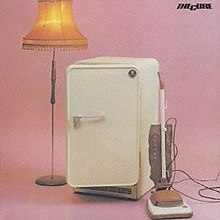
The Cure have undergone several stylistic changes in their career. While they're better known for their later work with albums such as Disintegration, 1989, and The Head on the Door, 1985, my favourite album is probably their first album, Three Imaginary Boys. In this album lies Boys Don't Cry from several different recording sessions. What I love about this album is that it's not great. The raw and authentic sound to all the songs, some okay, some not great, shows The Cure in their teens still working things out. Their style is under-established, sweet and naive to what they'd be facing in their careers. Below I have embedded the album so you can have a 30 second preview to the songs, unless you already have Spotify downloaded.
In the past, I have done a photo shoot similar to the image on the cover of the album. These photos were taken to express empty space, but I think for my own digipak cover, I'd like to reverse this and create something concerning more lack of space. The Cure in 1979 were young and fun, and I think that's something I feel more inclined to picture.
Wednesday, 7 February 2018
Music Video Edit 3
Following the peer feedback, I realised what I really needed to focus on was capturing an 80s style. Youtube came to my saviour with some fabulous people sharing their ways of using post-production editing to create the effect they want
Tuesday, 6 February 2018
Subscribe to:
Comments (Atom)
Popular Posts
-
Sing Street, (2016). Directed by John Carney Sing Street is a film that I has been on my mind every since I first watched it upon relea...
-
It is done. I have it all written down and planned out and I feel sick with stress and nerves. But, to help log my own thoughts and plans I ...
-
So what I've done now is used the footage I already have to make up the blank spaces you saw in my first edit. The band I had used are...


